

HUman Factors Portfolio
daniel x. francis
Last Updated:
May 5th, 2023
Contents
About me

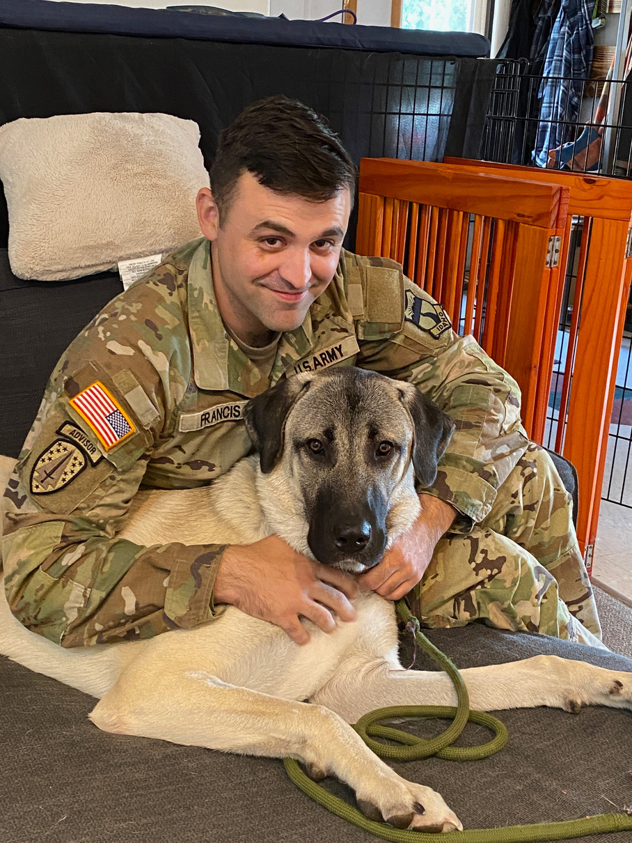
I was born in Berlin, Germany on January 30th, 1992, and spent most of my childhood in Manassas, Virginia. I attended American University in Washington D.C., where I studied psychology and swam for the American University Swim Team. After graduating and finishing my undergraduate degree, I worked with teens in a long-term residential treatment center for a year, before eventually joining the Army in 2016. My Army career has focused on my military intelligence and has taken me to Germany, Korea, Afghanistan, and all over the United States.
In my personal time, I enjoy reading, working out, camping/hiking, and building and water-cooling computers (although that has been difficult over the last few years, given the price of components). I also enjoy any activity where I can bring Rue. my Anatolian Shepard, with me.
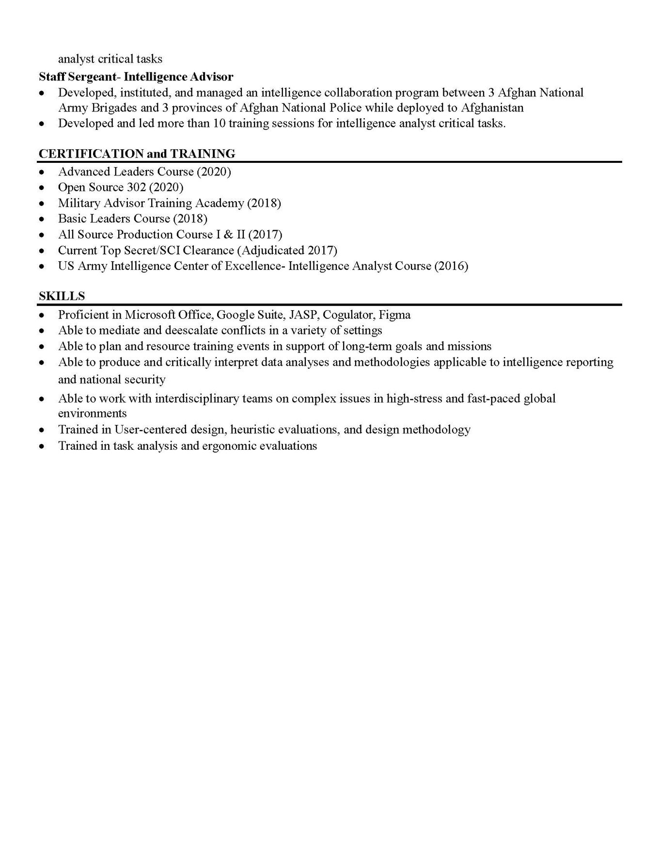
My Resume

- CoffeE time
Background- the Employee, the Job, and the Tasks
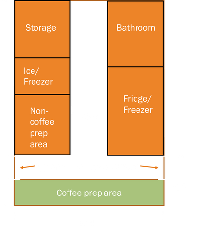
Clark has been employed at Dutch Bros for the last 18 months. She is also fairly active, participating in Army ROTC and serving in the Idaho National Guard. She has a pre-existing hip issue and is not supposed to carry more than 10 pounds at a time or walk further than a mile at a time. The client states that her shift work at Dutch Bros can often exacerbate the hip pain and discomfort that she experiences. Dutch Bros is a small, drive-through, or walk-up style coffee shop on Main Street in Moscow. The main building and coffee shop are relatively small, measuring approximately 10ft by 20ft. Storage facilities, an employee restroom, multiple fridges and freezers, and two separate drink preparation areas comprise much of the interior space. This leaves the workers a relatively small area to move around the interior and prepare drinks. Shifts at Dutch Bros are typically scheduled for 4-6 hours. However, the actual time at the job site can easily stretch longer than that if you are expected to close for the day, as there are many cleaning tasks and preparations that must be done for the next business day. Tasks throughout the workday include stocking the storage shelves (both inside the shop and at the storage sheds), preparing drinks, and restocking the refrigerators inside the shop.
Above- A diagram and measurements of the Dutch Bros interior
THE Positive and Negative Features of the Job
Dutch Bros currently has several policies in place that help protect employees and are beneficial to job performance. First, during busy periods such as in the morning before typical business hours, staffing is increased from the standard three employees to six to eight employees, which helps to reduce the workload. Additionally, Dutch Bros has an established hourly rotation between each position in the shop, providing a
Several less beneficial factors are also at play on this job site. To begin with, while the staffing increase
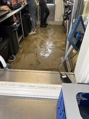
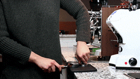
during busy hours can help spread the workload, making it highly crowded inside the small shop. Additionally, the shop lacks any stools, chairs, or furniture to rest on. Clark reported that several employees take bathroom breaks just to have an opportunity to sit down. Also missing is any ladder or step stool to reach high shelves in the front of the shop or on the stock shelves in the rear storage area. This can lead to workers putting themselves into unsafe and unergonomic positions to reach their supplies. Clark reported that she often had to physically climb on the shelves to reach items stored on the shelves. The floor of the coffee shop can also become quite slick throughout the day from spilled drinks, condensation, and melting ice. Some drink preparation tasks also harm the employees, especially espresso preparation. The tamping of the espresso requires users to press down very firmly onto the portafilter while maintaining wrist extension. This can cause a significant amount of strain on the wrist for all employees, but for shorter employees like Clark, it can also place additional strain on the elbow and shoulder.
Top- A picture of the wet and slippery concrete inside the coffee shop.
Bottom- A demonstration of the espresso tamping procedure. Note the stress it applies to shoulder and wrist.

Recommendations- For Clark and the Company
My first suggestion to Clark was to utilize a small elevated platform while preparing coffee. This helps to mitigate the problem of a fixed-height countertop that does not allow her to maintain a proper upper body position for tamping and placing the portafilter into the espresso machine. The elevated position provided by the platform would enable her to exert the required force without unduly contorting her upper body. It was also recommended that she use that platform or a secondary step stool to help her reach the tall shelving throughout the shop. Also recommended was a small stool or folding chair that would provide an easy way to sit and rest during break times and be easy to store under the counter. Finally, I recommended avoiding slipping inside the shop and while walking to the car waiting area.
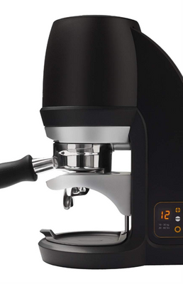
The first recommendation for the Dutch Bros management is to provide another set of non-slip mats for the shop's interior to help mitigate the slip risk from the wet floor. Ideally, this mat would also be cushioned to relieve workers who spend most of the day on their feet. An adjustment to the work schedule to ensure that taller individuals are spread out to cover many different shifts to facilitate accessing some of the items stocked on the higher shelves in a safer manner. Finally, the most expensive recommendation was to purchase an automated tamping machine to reduce the stress on workers’ upper limbs. A device like the Puqpress (which automatically tamps the espresso for you) essentially eliminates the tamping task for the worker.
Above- A suggested pair of shoes to help increase traction in the slippery conditions inside the coffee shop.
Left- A Puqpress machine that automatically tamps the espresso grounds.
2. Home media redefined
Introduction and Background
When Netflix first launched its streaming service in 2012, it marked a significant paradigm shift in how people consumed tv and movies at home. However, the recent proliferation of streaming services and the segregation of content between them has made the dream of cutting the cord and just using one or two streaming platforms a much less feasible[DF1] option. But there is another option: a home media server (HMS). This software allows users to build up their own media library without the need to subscribe to a vast amount of different streaming services. This project will work to develop a new, streamlined experience for home media server management.
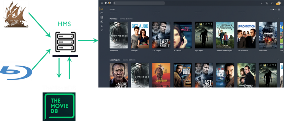
A home media server is a type of software that allows users to create their own Netflix or Amazon-style video library and streaming service from their own home. Users import their own media files by either ripping the content from a DVD or Blu-ray or downloading it from the internet. The remarkable thing about this software is that it allows users to watch their media on one device and share it with family and friends, locally and over the internet.
Project Goals, Stakeholders, and Requirements
As mentioned, home media servers can often take a lot of work to set up and manage for inexperienced users. As such, the main goal of this project is to develop a server management experience that is approachable to unsuspecting users, effective for experienced users and integrates several new features that are rare in current home media servers.
There are three main ways that I identified requirements and stakeholders for this project. First, the Plex, Kodi, and Emby (three of the most popular HMS programs available today) subreddits were reviewed, emphasizing posts about feature requests and user complaints. Next, a survey was distributed to these subreddits to collect data about how users interact with their home media servers. Finally, the most popular companion apps were reviewed, and the features they offered to the home media server were evaluated.
Above- How home media servers integrate data and build media libraries.
Following the initial data collection phase, several vital functional requirements were identified. First, the system must recognize, collect, and systematically display media files in an organized manner. Next, the system must match the file to an online database and download meta-data for the stored media. Third, the system must communicate with client devices over local and wide area networks to distribute media. Finally, the system must be able to transcode media (change the resolution and file type) to serve client devices with different capabilities and requirements.
Several non-functional requirements were also identified. The server management home screen should allow users to quickly ascertain the status of their servers and view critical details about users currently online. Next, the server clients should be able to submit content requests to the server administrator and have the server automatically download those files. Third, the server should also provide more detailed network monitoring solutions. The last requirement was to provide additional logging of how clients engage with the server and to provide server administrators with other tools to manage those clients.
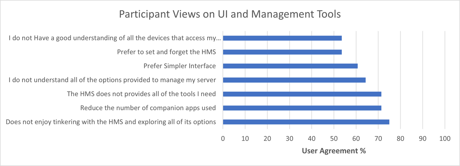
Right- User sentiment about server management UI and tools.
Prototyping
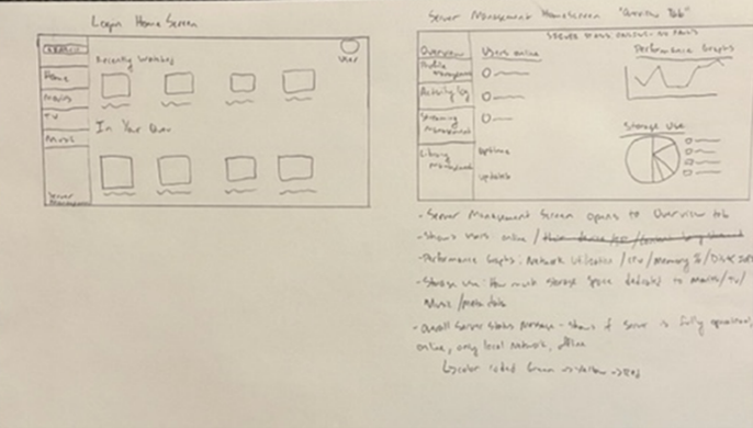
The first redesign attempts began with wireframe diagrams of how the server management pages should look. The wireframing, while a very rough design, helped to develop the basic layout and spot initial, apparent flaws in the design. This early design stage took a horizontal approach to development and implemented a broad set of features and changes.
Following these initial wireframe designs, an initial prototype was made in Figma. This first draft design highlighted the noteworthy features I wanted to include in my updated design. After completing my first design in Figma, I shared this design with a few users on the forums I surveyed earlier and solicited some of their feedback. This feedback included removing a few features, placing all options on a single page, and increasing automation features to let the system adjust without user input. I also had some personal design goals here to improve the interactivity of the prototype, redesign my button layout, and provide a more vertical design slice to better showcase all the app’s features.
The second design was a dramatic upgrade over my initial plan. The strategy here was intended to be a vertical slice to highlight a few of the features I had worked on improving. One of the pages that received the most updates was the server management screen. Opening the overview pane immediately allows admins to quickly see their server's status briefly. They can immediately see the server is online, how much storage is being used, who their most active users are, and if they are online right now, an error log for recent interruptions to server activity, and a network usage graph to see how much data has been transmitted by the server recently. Beyond simply updating this demo’s features, all display items were updated to present a more polished and professional appearance.
Top- An initial wireframe design that helped solidify design goals for future prototypes.
Bottom- A video with a walkthrough of the second prototype. This was much more narrowly focused and vertical prototype looking at the overview and network management screens
Conclusion
The main goal of this project was to develop a server management experience that is approachable to inexperienced users, effective for experienced users and integrates several new features that are rare in current home media servers. This shift in design has become increasingly necessary as users seek out home media servers as alternatives to the ongoing stratification and segregation of streaming media content across different streaming platforms. The design here focused on improving the server management options and creating a more streamlined toolset.
3. Tesla model 3- a missing piece
Introduction
Tesla has done much to advance the market and technology in the electric vehicle market. Despite these advancements, Tesla’s vehicles have faced many issues and strange design choices. In particular, the Model 3’s new dashboard design has presented several user challenges and problems and could benefit from a Human Factors evaluation.
Instrument Cluster and Steering Controls
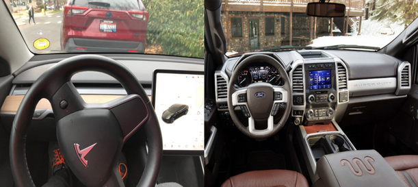
The most noticeable departure the Tesla Model 3 makes from a conventionally designed automobile is the lack of a traditional instrument cluster behind the steering wheel. Instead, the instrument cluster shares a portion of the center touchscreen with the entertainment system. The colocation of the instrument cluster with the entertainment system causes issues with saliency as important vehicle information is less distinguishable from the surrounding entertainment information. Furthermore, the Tesla display includes not one, but three separate speed indicators in a row, slowing the driver’s visual search.
In contrast with traditional designs and posing an issue for information access, the Tesla instrument cluster is farther from the driver’s primary field of view, requiring a significant head movement to access this information. This increases the time it takes to access the information and makes it less likely that the driver notices any changes in that information. A possible solution is implementing a heads-up display (HUD) system. Unlike Tesla’s current setup, this system groups high-value information sources in proximity, effectively and quickly integrating both sources of information.
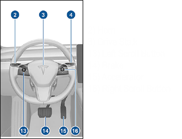
The Tesla Model 3’s steering wheel controls offer significant challenges from a human factors perspective. Three controls account for seven different features on the steering wheel, and two scroll wheels control an additional seven functions. While some controls offer adequate labels, the two scroll wheels lack appropriate labels. This is where users often suffer from mode error issues and contradictions with the user’s mental model of how these controls should behave.
Above Top- The Tesla dashboard compared to a more traditional setup in a F-250
Above Middle- A diagram of the Tesla Model 3 steering wheel control scheme
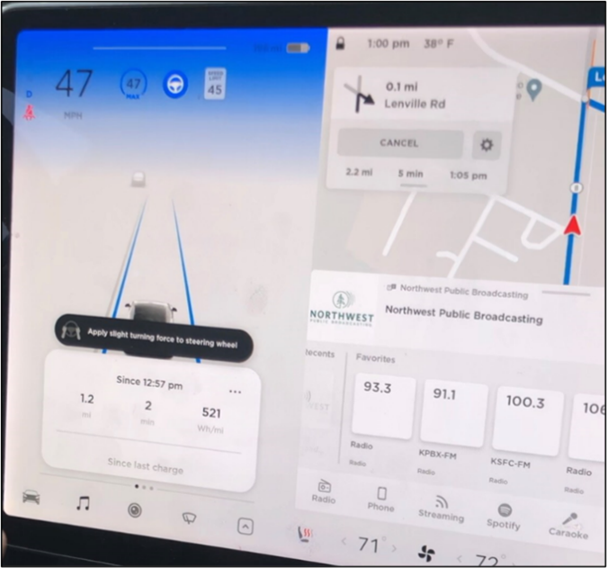
Right- The flashing blue alert and warning message that the Tesla shows when it detects the driver has removed their hands from the wheel while in autopilot. Also shown is the small blue steering wheel icon, which indicates the autopilot is active
The Model 3’s Self-Driving Feature
To begin, Tesla’s self-driving or “Autosteer” feature attempts to combat one of the most common pitfalls of automation: loss of situational awareness by the user. It does this by attempting to alert the driver and shutting down the system when it detects no hands on the steering wheel. Unfortunately, this can cause mode errors as this transition between driving states is not clearly announced. Adding tactile or audio feedback to the Drive Stalk movements will help clarify to operators if they are moving the stick an appropriate distance to engage the autopilot feature. Also, an audio alert would help explain to drivers that the autopilot is engaged and fully functioning.
Alerts and Navigation
One of the better features of the Model 3 is its included navigation system. Tesla utilizes a tethered frame of reference for its navigation software, which allows users to experience some of the benefits of both an egocentric and exocentric frame of reference. It provides a relatively slow and steady zoom feature to preserve visual momentum across all displays, minimizing disruptions to the user’s engagement with the map. When the map is set to the heading-up setting, the information displayed on the map, the driving display on the left-hand portion of the screen, and the windshield are all coordinated with matching reference points. This helps preserve momentum across all Tesla displays and helps prevent users from being disoriented by navigation screens.
Alerts for items such as seat belt status appear in the lower left-hand portion of the screen and occupy a significant part of the screen. Additionally, the size of these non-emergency alerts makes them significantly more noticeable to the driver, drawing their attention away from a high-value information area (windshield) to low-value information (the non-emergency alert). This can reduce the driver’s situational awareness and ability to react to hazards on the road. To mitigate this issue, the initial display of the alerts could be made smaller as they are non-critical safety alerts. Additionally, differentiating between emergency and non-emergency alerts would help to avoid the conservative bias that repeated displays of these non-emergency alerts can cause.
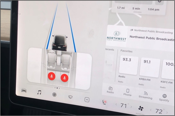
Above- The seat belt warning that consistently displays in the lower left-hand portion of the screen. This alert can trigger without person in the seat as the sensor utilizes weight to determine if a person is present or not
Conclusion
While Tesla has done much to push the current envelope of electric and autonomous vehicles, some of their innovations have created a host of secondary issues- particularly in the current dashboard design, the functionality of the alert system, secondary controls, and the automatic driving system. However, many of these issues have relatively simple fixes, which would rapidly allow them to be updated to match the well-designed navigation system.
4. Infant Safety and standards
Introduction and Background
Standards, and evaluations of products against those standards, are a vital part of designing, producing, and marketing safe and viable products to the public. Consumer protection in the United States can trace its roots back to the late 1800s when Congress first introduced legislation on the dilution and mislabeling of food and drugs. Since then, consumer protection standards have grown even further with the Consumer Product Safety Commission (CPSC) introduction in 1972 through the Consumer Product Safety Act. Currently, the CPSC works with organizations like the American Society for Testing and Materials to develop standards and test thousands of different categories of products.
Of these thousands of products evaluated against the standards of these organizations, one of the most important categories is that of the infant bouncer and activity center. Using these devices can present a false sense of security as parents look to these devices to entertain their children as they complete other tasks. Considering this fact, a popular brand of infant bouncers and activity jumpers was evaluated against the ATSM Standard F2167-22, the standard for this product category. The product to be reviewed is the Baby Einstein Neighborhood Activity Jumper produced by kids2 and will be referred to as “the product” for most of the evaluation.
The Evaluation- General, Performance, and Marking Requirements
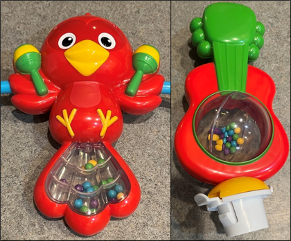
The general evaluation category is a broad overview of the product and begins with a visual and tactile assessment. This section primarily focuses on identifying features of the product that, through manufacture intent or defect, could cause harm to the infant in regular use (sharp edges, pinch points, etc.) The product passed all these standards with only a few caveats. The product remained free of any sharp edges or points throughout the testing period, and small pinching areas were out of reach of the child. Two toys contain several tiny beads that could block nasal passages or present a choking hazard to infants if they become broken during an accident.
Right- The two toys that have small beads that could pose a hazard if broken.
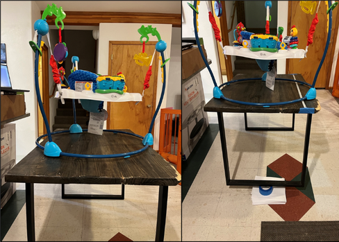
The performance section of the evaluations sets out guidelines for how the product should perform while in use and has various standards for stability, load bearing, and structural integrity. To simulate the presence of an infant, a 15-pound kettlebell was loaded into the seat. A force was applied from all four sides of the product, both while the product was level and at a 15-degree angle. No lipping or changes of position were noted. This section also included the durability testing of the product, where it would be dropped from a 3-foot height onto all of its sides. These drops caused no significant damage or problems to the product.
The final section covered the safety marking requirements that needed to be included in the item. All relevant safety markings and images were included in the appropriate areas. One minor issue was noted where the manufacturer's date of manufacture and contact information was difficult to find on the exterior packaging.
Above- The flat testing surface on the right and the elevated testing surface on the left.
Recommendations
This standard comprehensively describes the item's basic safety and durability features, but several adjustments could be made. To begin with, the standard needs to mention something regarding the flammability of the item. Including a brief description of the issue and linking to the relevant flammability standard for bedding or clothing is sufficient. Additionally, while the product does contain verbiage about Federal guidelines prohibiting the use of lead paint, the standard doesn’t mention any other hazardous materials. This could easily be fixed by including an appendix at the end of the regulation with a cross-referenced list of additional rules on the materials and construction of the product with which it must comply.
Regarding technology, it would be beneficial to include a barcode or QR code on the packaging that a consumer could scan and then be linked to the product’s results from being tested against the standard by a government agency like the Consumer Product Safety Commission. Second, given the commonplace nature of baby monitors and the continued proliferation of the Internet of Things devices, the standard should be adjusted to accommodate wireless or IOT functions into this product class.
Conclusion
The Baby Einstein Neighborhood Symphony Jumper was evaluated against the ATSM standard F2167 – 22 Standard Consumer Safety Specification for Infant Bouncer and Entertainment Seats. Overall, the product in question complied with most of the standards presented in F2167 – 22. However, this evaluation was constrained by the lack of appropriate testing materials (i.e., an appropriately sized and weight dummy of an infant) and the fact that none of the toys accompanying this product were evaluated. In addition to the primary evaluation of the product, several critical areas for future improvement in the evaluation were noted.
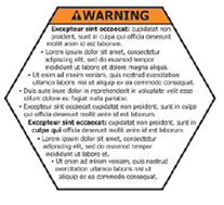
Above- Example warning label from the standard.
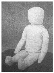
Above- The recommended infant dummy from the standard.
5. Radio chatter
Background
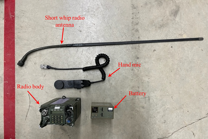
Assembling a radio is a critical and basic task for every soldier in the United States Army. To help facilitate the training of this task, a task analysis of assembling and programming the AN/PRC-119E Advanced Special Improvement Program radio (commonly referred to by its acronym ASIP) was completed. For this task analysis, the CMN-GOMS style of task analysis was utilized. This breaks tasks down into Goals (what the operator is trying to do), operators (the individual actions that comprise a task), methods (one of several ways to complete a task), and selection rules (the rules that guide which method an operator should use). Also facilitating this task will be the use of the program Cogulator. This program allows users to quickly and easily build several different kinds of GOMS task analyses while automatically calculating the time required to complete the task.
Above- The components of the ASIP radio for this task. This includes the radio body, short whip antenna, hand mic, and radio battery.
Task Description
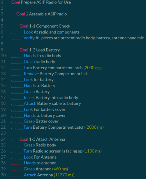
This task's overall goal was to prepare an ASIP radio for use. This goal was further subdivided into two subgoals, each with its own subgoals contributing to their completion. The first subgoal was to assemble the ASIP radio (goal 1). Within this goal, three subgoals were identified. Goal 1-1 was verifying the presence of all necessary components to complete the task. This includes the radio body, the hand mic, the antenna, and the battery. The second subgoal (goal 1-2) in this stage was to load the battery into the radio battery. Goals 1-3 and 1-4 were to attach the antenna and hand mic to the radio body, respectively. Goal 2 is programming the ASIP radio. In this step, the radio must be turned on, and an initial systems check must be performed. (goal 2-1). Next, the radio settings must be adjusted (goal 2-2); this includes changing the radio power to high, the mode to single channel (it is initially set to hop frequencies as a security measure), and the communications security mode to plain text (as there is cryptographic key uploaded to encrypt the radio’s transmissions. The final goal in this section is to load the frequency that the radio will be operating on. Here the original frequency must be cleared, and the current frequency must be input. The final subgoal was to place the radio on its operational setting.
Above- Example task list for the first series of goals. The times noted in yellow are manually updated times to ensure the accuracy of the model
Problem Areas and Proposed Changes to the Task
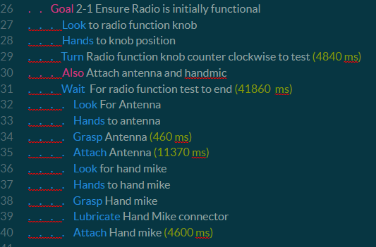
A large gap of downtime occurs when the radio is set to “TST” to test its basic functions before programming and using the radio. Changing the test of the hand mike and antenna from the item tested to the last item tested would allow the operator to attach the hand mike and antenna while the radio is running through its initial battery of tests. Based on the recording of the task and an analysis in Coagulator, this would save an estimated 22.01 seconds.
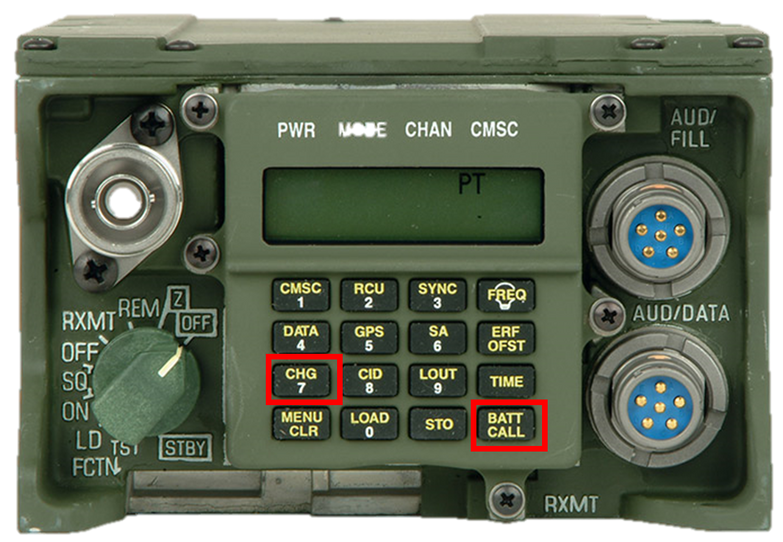
Another potential change that could be made to reduce the time needed to complete this task (and would likely make the task slightly more accessible for users), is to change the position, size, and actuation style of the buttons on the radio. For example, if the “BATT CALL” and “CHG” buttons were swapped, operators could engage with the device using two hands, which would have several immediate benefits to improving usability with gloves and a general reduction in task time. The inconsistent feedback provided by the buttons and slow screen response time can slow and induce errors in the radio programming task. Currently, it can be tough to tell if a button is pressed correctly and that the input was registered by the radio, especially if the operator is wearing gloves. Because of this, operators are forced to monitor the screen for an extended period to ensure that their input has been registered. This task has 19 button presses that require such comprehensive verification to ensure that the input has been appropriately registered by the radio, which accounts for approximately 23.75 seconds of the overall task time. Having buttons that offer more feedback and an improved screen would reduce the time needed to verify that the inputs had been logged by an estimated 12.6 seconds. This update would work in conjunction with the suggestion made earlier to change the position of the “CHG” button.
Top Right- The task list shown above feature the updates to the task order. Attaching the hand mic and antenna now run simultaneously with the radio testing. This is indicted by the "Also" command
Right- The faceplate of the radio with CHG and BATT CALL buttons highlighted. Swapping these two functions would allow the operator to use two hands to adjust the settings
Conclusion
For this task analysis, the CMN-GOMS style of task analysis was utilized. This allowed for each step of this task to be broken down into its component steps and effectively analyzed. This analysis identified several key areas of improvement in the task order and radio test feature, the button placement and feedback, and the connecting mechanism for the antenna and hand mic. These improvements will potentially lead to improvements in the capabilities of all soldiers that master the assembly and programming of this radio as part of their individual soldier skills.
6. perceptions of decision aids
Introduction
The recent release of ChatGPT, with the incredibly natural responses and advice it can provide, has highlighted how algorithms and large language models can assist human decision making and performance in a wide variety of tasks from aerospace to computer assisted design, and even healthcare. Research has continued to show the effectiveness and accuracy of employing computer assistance in these tasks. Given these findings on the accuracy of actuarial methods, it is somewhat surprising that patients frequently indicate a preference for doctors and clinicians that avoid using algorithms and rely on clinical experience and heuristics in making their judgments. Despite this large body of research on the efficacy of actuarial methods and patient mistrust of the same methods, little research exists on how patients interpret the use of actuarial methods in conjunction with doctor experience. As such, the current study will seek to explore the interplay of physician experience in the context of actuarial/algorithm, clinical/heuristic, or hybrid approaches to prescription recommendations.
Participants and Methods
Participants (N=97) were recruited from the University of Idaho undergraduate psychology student population. The sample consisted of 25 men (mean age of 19.4, SD=1.6) 66 women (mean age=20.7, SD=4.7), and 6 non-binary individuals (mean age of 19.1, SD=1.9). Participants were randomly assigned to one of two conditions manipulating the experience level of the three doctors. The experience of the three doctors was described experienced (more than 5 years) or inexperienced (less than 5 years of experience). All participants were presented with three decision strategies utilized by the doctors- clinical, actuarial, and a hybrid method.
The survey was created on Qualtrics, and participants were able to access the survey through Sona Systems. Participants were told to imagine that they were experiencing symptoms of cardiovascular disease and were consulting with three physicians who would review the patient’s symptoms and make a diagnosis. Each physician was described as utilizing a different decision strategy (clinical, hybrid, actuarial) for making a diagnosis. All participants were presented with each of the three decision making scenarios. The order of decision strategy was counterbalanced. For each scenario they were asked to rate the scenarios in terms of their preference for it, its accuracy, and how ethical it is. The rating scale utilized consisted of five points from “not at all” to “extremely.”
Preference of style
Results
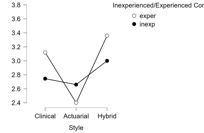
A significant preference for decision style was identified among the participants, F (2, 97) =9.37, p<0.001. ηp2= 0.099. To further identify the differences between the clinical, actuarial, and hybrid approaches, linear contrasts testing was conducted. The hybrid approach was significantly different from the actuarial approach t(170) =-4.30 p<0.001, but not from the clinical approach, t(170) =-1.71, p= 0.09. Preference was also shown for the clinical approach over the actuarial approach, t(170) =2.59, p<0.01.An order effect was also identified, F(5, 85) =6.11, p=<0.001, ηp2= 0.26, but there was no signification interactions of order with decision style or experience level (p > .05).There was no significant difference identified in preferences between experienced and inexperienced physicians F(1, 85) =2.03, p=0.16
Accuracy of Style
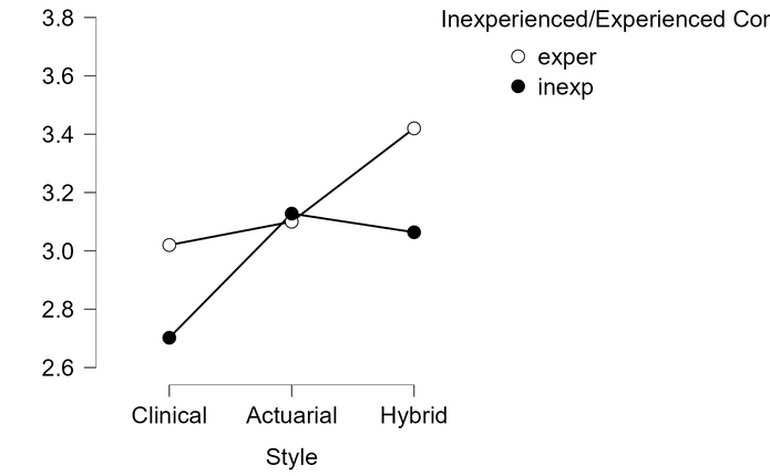
A statistically significant difference was observed in how the participants perceived the accuracy of each style, F(2, 170) =5.53, p=0.005. Further contrast testing indicated that the actuarial and hybrid styles were viewed as more accurate than the clinical approach, t(170) =- 2.11, p=0.04 and t(170) =-3.28, p=0.001 respectively. The hybrid and actuarial approaches were not viewed as significantly more accurate than one another by participants, t(170) =-1.18, p=0.24. There was a significant difference identified in perceptions of accuracy of each style between experienced and inexperienced physicians, F(1, 85) =5.12, p=0.03, ηp2= 0.06. Experienced physicians were perceived as more accurate than inexperienced physicians.
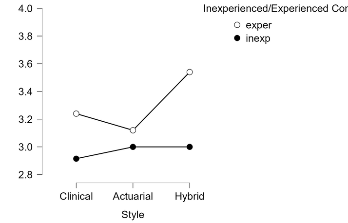
The final measure evaluated how ethical the participants viewed the clinical, actuarial, and hybrid styles. Participants did not view any particular style as being inherently more ethical than another, F(2, 170) =1.80, p=0.17 . A small interaction effect for decision style by order was identified, F(10, 170)=2.18, p=0.02. A significant effect was found between the experienced and non-experienced physicians, F(1, 85)= 6.89, p<0.01. The decision styles of experienced physicians were rated as more ethical than the decision styles utilized by the inexperienced physician.
Ethics of style
Discussion
The results in this experiment generally aligned with the researcher’s expectations prior to the start of the study. Participants reacted most positively to the hybrid style, which combined the accuracy of the actuarial style with the comfort of maintaining the oversight of the attending physician. Significant distrust of the actuarial system likely arises as the patient has little insight or knowledge of how the system calculates and assesses their need for a prescription. However, the addition of the doctor who then utilizes his clinical experience to confirm the output of the algorithm restores a great deal of confidence to the system.
Participants in this study assessed the hybrid and strict actuarial styles as significantly more accurate than the purely clinical approach. Interestingly, this preference for the hybrid methodology shifted when participants were in the inexperienced physician scenario. Here, the clinical was still rated lowest, but the actuarial style was rated as being more accurate than the hybrid method. This shift may be an attempt by participants to compensate for the inexperience of the physician by more highly rating a style that does not rely at all on the experience of the physician. When participants evaluated the ethics of each of these styles, a significant difference was identified between the inexperienced and experienced conditions. Like the evaluation of each style for accuracy, participants seem to weigh the experience when evaluating which style is more accurate.